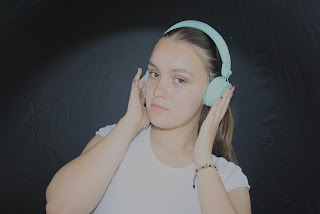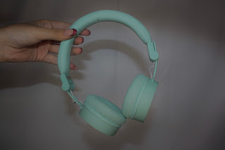
I like this photo to use a merch advertising , however i think i need to edit it to make it brighter, as the lighting is quite dark

I don’t like this one as my thumb is bent

Need to edit to make brighter

I like this picture as it is very engaging as it feels like ruby is putting the headphones on you

I like the effect of the shadows on this photo it is quite unique

This is a good photo to show off my merch with the star of the magazine

I like the simplicity of these

This needs some editing as ruby’s hands are a very bright orange compared to the rest if the image, but i like the framing

The shadow across rubys face looks cool

The lighting on this is really nice and calm and i like the simplicity of the image

These are too dark and the positioning of rubys hands aren’t framing the images well

I like this however it is a bit of a boring image

I like how candid this image is and i think it will be good on the website

The back to back pose is nice

This is good photo as Sophie and Pipers outfits and aesthetic match nicely together and the lighting is perfect

These are nice photos but not much is going on
 I like this photo to use a merch advertising , however i think i need to edit it to make it brighter, as the lighting is quite dark
 This needs some editing as ruby’s hands are a very bright orange compared to the rest if the image, but i like the framing
 This is good photo as Sophie and Pipers outfits and aesthetic match nicely together and the lighting is perfect


No comments:
Post a Comment